
The First VESS challenge took place in 2017, and had 3 categories (photography, motion and illustration).
First Place (photography):
Dr. Anne Schöpa - Helmholtz Centre Potsdam, GFZ German Research Centre for Geosciences
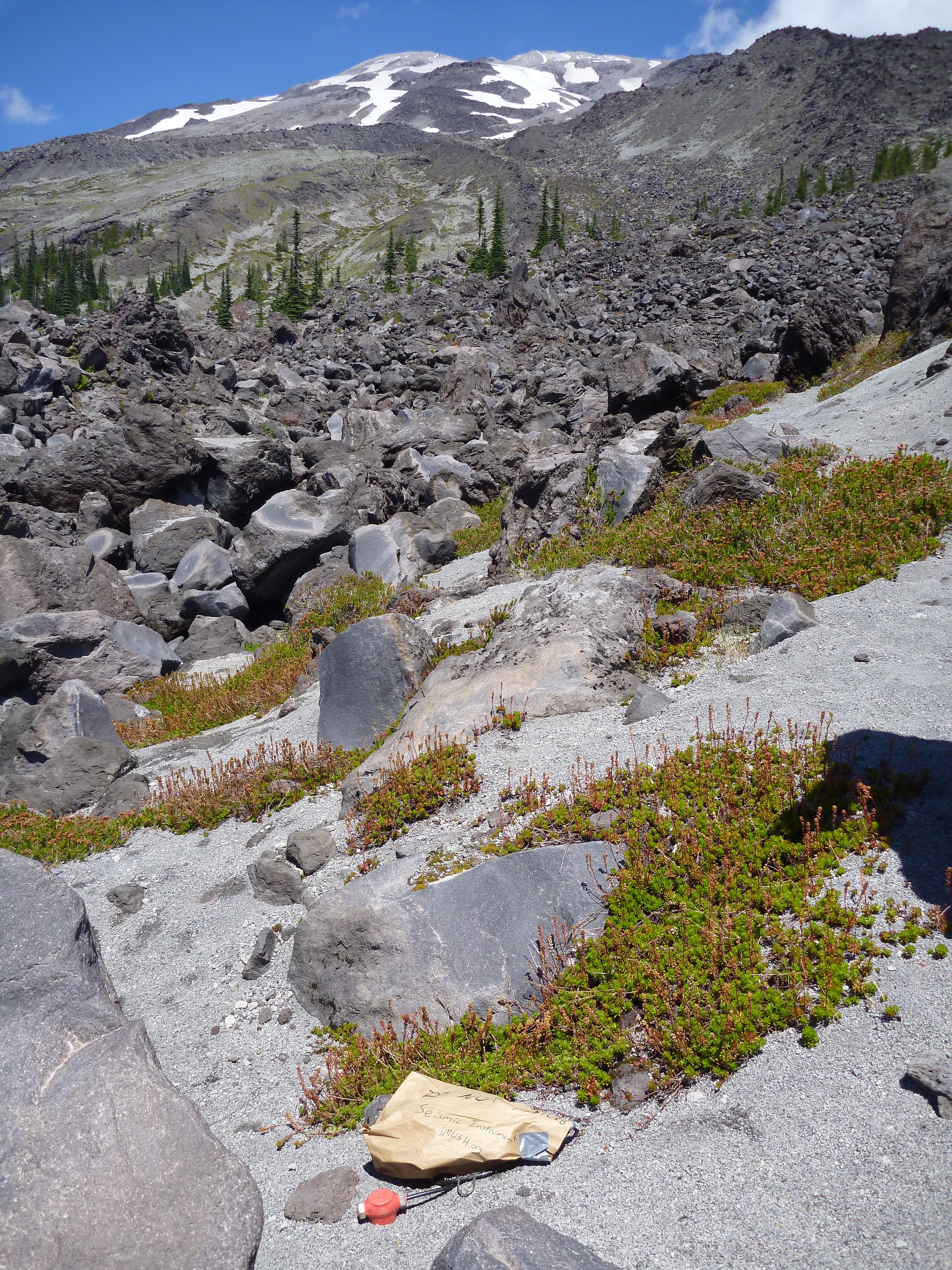
Looking for magma - 1 out of 6000 geophones of the iMUSH project at Mt. St. Helens Custom 4: The image was taken during the iMUSH project, imaging Magma Under St. Helens, imush.org, in July 2014. The geophone (red head sticks out of the ground) and the data logger (in a paper bag) are installed in a lava flow at the SW flank of the volcanic edifice. View is towards the summit of Mt. St. Helens, WA, USA.
Second Place (photography):
Amir Allam - University of Alaska Fairbanks / University of Utah
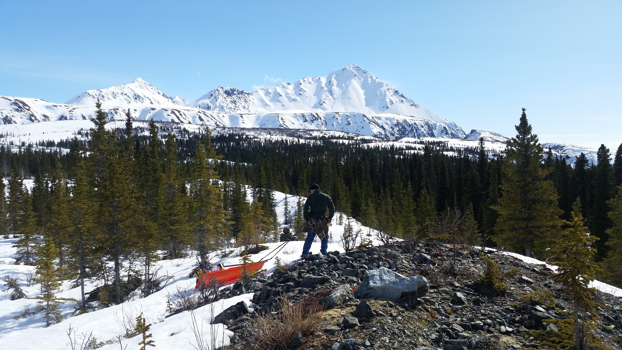
Alaska State Trooper Nathan Duce drags a sled full of geophones up a glacial moraine cut by the Denali Fault.
Third Place (photography):
Derek Witt - Colorado State University
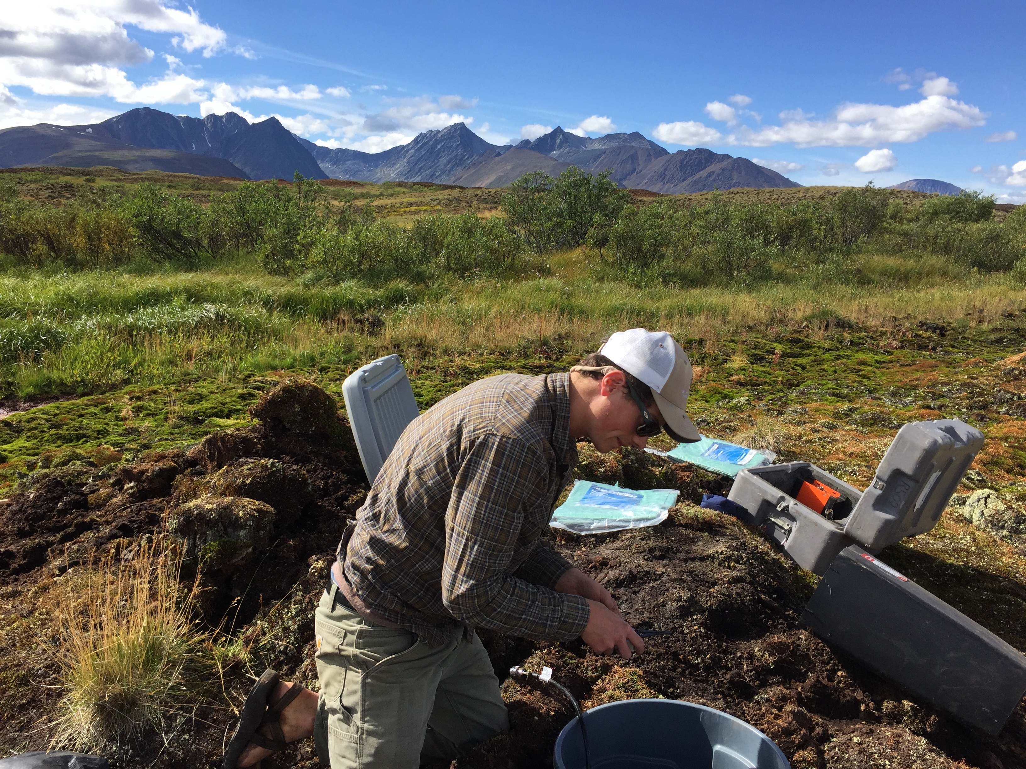
Graduate student, Derek Witt, deploys a broadband seismometer at Mile 216 of the Canol Road in the Mackenzie Mountains. This station will serve as one of the first ever broadband instruments in the heart of the Mackenzie Mountains. This station is part of a 40-instrument transect that runs from the NA-PA subduction zone, through the Mackenzie Mountains, to Great Bear Lake in the Slave Craton.
First Place (illustration):
Benjamin Murphy - Oregon State University
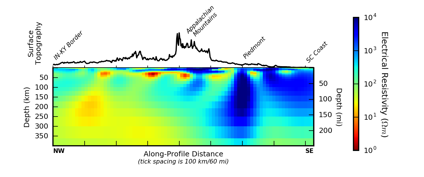
Using EarthScope magnetotelluric (MT) data from the southeastern United States, we found a highly anomalous electrically resistive region in the uppermost mantle beneath the Piedmont physiographic province. The northwestern edge of this unusual structure robustly corresponds to the sharp southeastern edge of the modern Appalachian Mountains, as shown here. We interpret this mantle anomaly as having played a significant role in the rejuvenation and persistence of modern Appalachian topography. (From Murphy & Egbert, Earth Planetary Science Letters, 2017.)
Second Place (illustration):
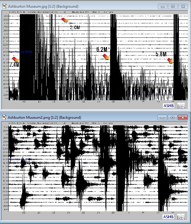
Ted Channel - TC1 School Seismometers, Idaho
“A Busy Seismic Day in New Zealand, Nov. 13, 2016 ”
Third Place (illustration):
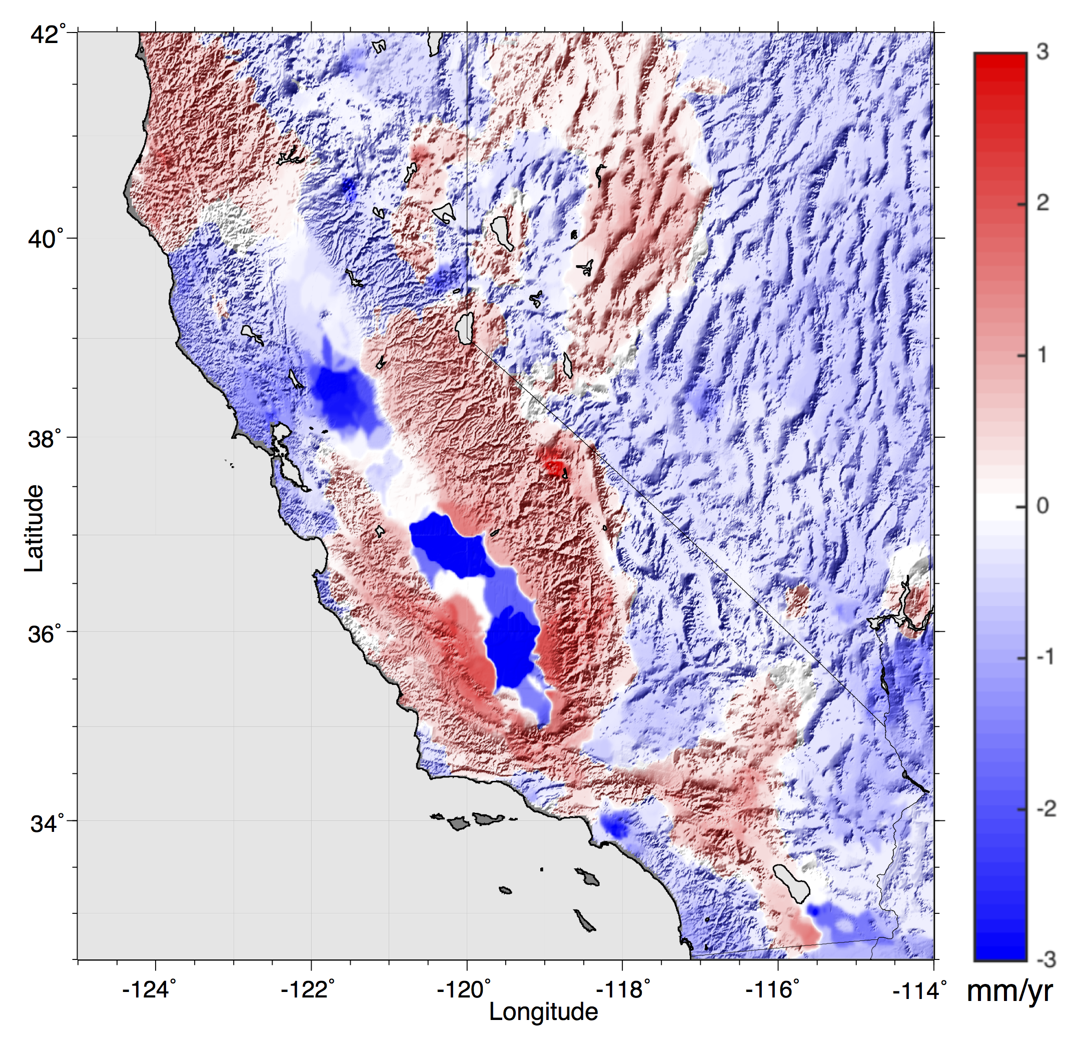
Bill Hammond - University of Nevada, Reno
Earthquake ghosts and mountain uplift. Map of California and Nevada with result of applying the GPS Imaging algorithm (Hammond et al., 2016) to the vertical MIDAS rates (Blewitt et al., 2016) superimposed on topography. GPS data are from the NSF EarthScope Plate Boundary Observatory and other networks in the western United States. Color scale is in mm/yr, positive (red) upward, negative (blue) downward, saturated at color scale limits. Red area in north-central Nevada is the mantle relaxation signal of past earthquakes on the Central Nevada Seismic Belt that ruptured between 1915 and 1954. Red between the Sierra Nevada crest and Central Valley of California shows active uplift of the range attributable to both tectonic forces and the loss of water load during drought conditions.
First Place (motion):
Kasra Hosseini - University of Oxford
"Fly-through of a seismic tomography model of Earth"
Seismic tomography is the pre-eminent tool for imaging the Earth’s interior. Since the advent of this method in the mid-1970s, the internal structure of Earth has been vastly sampled and imaged at a variety of scales, and the resulting models have served as the primary means to investigate the processes driving our planet.
Over 2.5 million cross-correlation travel times and 3.3 million high frequency picked arrival times were used to create the model in this video. USArray, the seismological component of EarthScope, was one of the main data sources used to dramatically increase the resolution of this model beneath North America and the surrounding area. Moreover, by using the core-diffracted seismic waves recorded by the USArray stations and other global seismic networks, we were able to sharpen the imaged structures in the lower third of the mantle (~2000-2800 km depth).
Second Place (motion):
2nd with 838 votes: Chengping Chai - Pennsylvania State University
"Receiver-function wavefield in the contiguous United States"
A major part of our data is from the EarthScope USArray. Our project is funded by the U.S. National Science Foundation (grants EAR-1053484 and EAR-1053363) and the U.S. DOE (grant LDRD-20120047ER).
Third Place (motion):
3rd with 181 votes: Scott Burdick - University of Maryland
Like a CAT Scan, seismic tomography lets us slice through the Earth without cutting into it. We find slices of “seismic velocity,” or the speed with which waves from earthquakes travel through the Earth. The seismic velocity is affected by many properties of the rocks making up the Earth’s mantle like mineral composition, melt, and fluid content, but the much of the variation in velocity is caused by temperature. Waves travel faster through rocks that are colder and stiffer. For this reason, images of seismic velocity usually use blue where waves travel faster and red where they travel slower. Seafloor is subducted at convergent plate boundaries when one tectonic plate is pushed beneath another, giving rise to natural hazards like earthquakes and volcanoes. The subducted seafloor is cold and strong, so it shows up in tomography as faster than average. The circle of convergent boundaries surrounding the Pacific Ocean is known as The Ring of Fire. The model in the video is created using over 13 million earthquake recordings made at seismometers from the USArray, the seismological component of EarthScope, and global seismic networks.
Other Submissions:
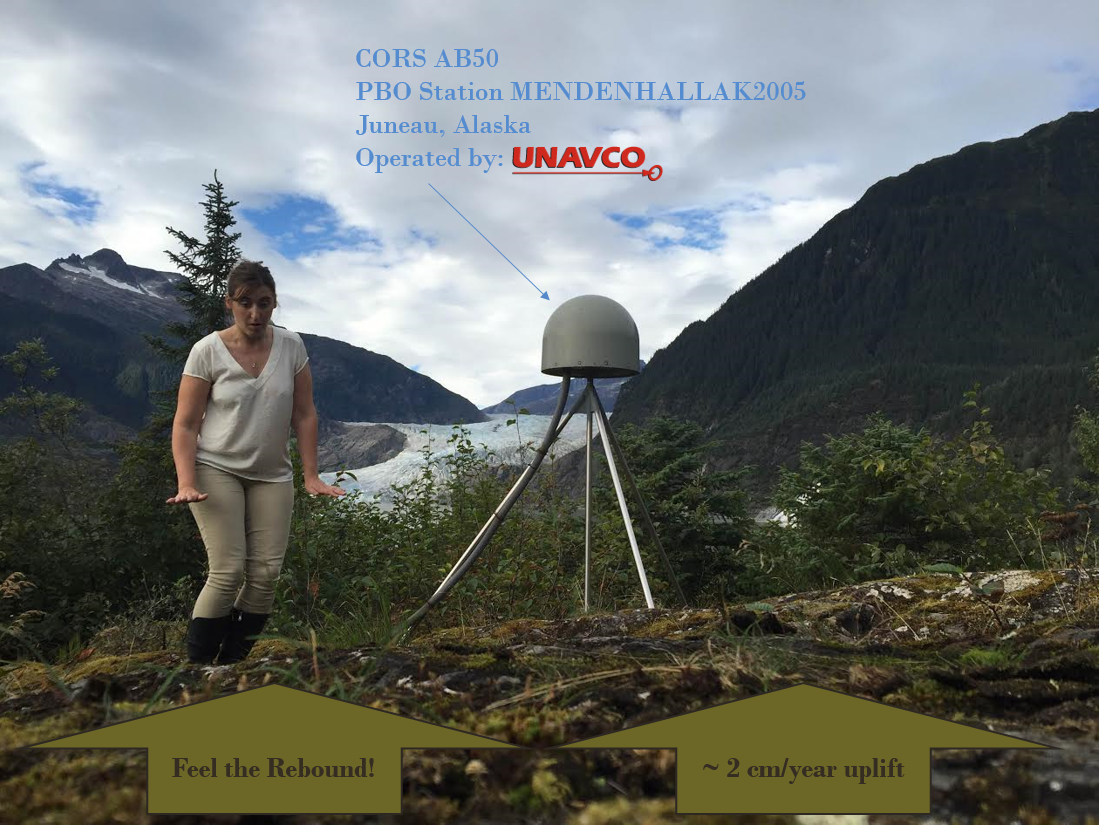
Nicole Kinsman - NOAA's National Geodetic Advisor for Alaska
NOAA's National Geodetic Advisor for Alaska, Nic Kinsman, feels the earth move under her feet at Mendenhall Glacier in Juneau, Alaska. Many EarthScope PBO stations in Alaska are part of the Continually Operating Reference Station (CORS) network, a multi-purpose cooperative endeavor that allows surveyors, GIS users, engineers, scientists, and the public at large to use public NGS tools (such as OPUS) to obtain post-processed coordinates in alignment with the National Spatial Reference System.
![]()
Victoria Hilke - High School Student at Santana High School, San Diego & Intern at Scripps Institution of Oceanography
Avatars for the TILT TRIVIA app (available for Android and iOS devices). These avatars were specifically designed for use in the TILT TRIVIA fracking game. From top to bottom, and left to right, these avatars depict: an oil drop, an oil tycoon, an Oklahoma talisman, a geoid, seismogram gal, work boots adorned with a flower, donkey w/hard hat as a play on words of the “oil donkey” machinery used in oil extraction, and a water droplet.
_0.png)
Yinzhi Wang - Indiana University
A three-dimensional, vector-formed image volume of P to S scattering potential under all of the lower 48 states are produced with the plane wave migration (PWMIG) method, after processing 2,458,973 three-component seismograms from all USArray stations with and 141,080 pairs of high-quality receiver functions from the EarthScope Automated Receiver Survey with the generalized iterative deconvolution method. The cross-section cutting through the PWMIG imaging volume with orientation along the direction of subduction shows the normalized radial amplitude of scattering.
Transverse amplitude ratio measuring the absolute transverse amplitude over the norm of radial and transverse amplitude is argued to be an indicator of small-scale surface roughness. It is mapped as an attribute on the 410-discontinuity surface manually picked from PWMIG result.
Large-scale topography of the surface is reflected on the distorted lattice. The color scale of transverse ratio is set to transparent under 0.25. Black lines are the state boundaries and coastlines mapped to a constant depth of 400 km for geo-reference.
Cartoons at upper right corner are the possible models of P to SH scattering producing the observed transverse signal: 1) a sharp interface with rough topography at a scale well smaller than the wavelength and 2) a sharp boundary overlain by interleaved sheets of variable properties that behave anisotropically. These small-scale roughness features are superimposed on the large-scale topography variation for the discontinuities.
_0.png)
Debi Kilb - Scripps Institution of Oceanography
Our aim is to design an automated detection scheme to catalog local earthquakes recorded by the USArray Transportable Array (USArray TA) network (points distributed throughout the continental United States), which can be used to help test the hypothesis that a large earthquake (e.g., large star, contours illustrate the mainshock’s seismic-waves trajectory where the bolder the contour the larger the seismic- wave amplitudes) can trigger small aftershocks at remote distances (i.e., small star, many mainshock fault lengths away).
These distant aftershocks are assumed to be triggered by dynamic stress changes caused by the mainshock’s seismic waves (pull-out cartoon).
Kyle Murray - Cornell University
A model of the change in elevation of the earth’s surface from late 2002 to 2010 in a ~ 100x100 km area in the southern San Joaquin Valley of California. Large subsidence signals with rates reaching over 25 cm/yr over this time span are a result of extraction of hydrocarbons in the south and groundwater in the north. Periodic variations each year are a result of seasonal recharge of water to aquifers in wetter months - slightly offsetting the groundwater extraction. These seasonal variations are not seen in areas where hydrocarbons are being extracted such as the Lost Hills Oil Field in the south. Subsidence rates have increased in recent years. Data is from Earthscope’s archive of synthetic aperture radar (SAR) data from the Envisat satellite.
Kimberly Schmid - NOAA’s National Geodetic Survey
This video animation illustrates the apparent motion of select stations in the Continuously Operating Reference Systems (CORS) network, across a prototype NATRF 2022 reference frame. The plotted points are derived from weekly time series data from each station.
Xiaotao Yang - University of Massachusetts Amherst
EarthScope OIINK Plane-Wave Migration image volume using teleseismic P-wave receiver functions. Animation illustrating three-dimensional geometry of Moho surface estimated from EarthScope OIINK (Ozark, Illinois, Indiana, Kentucky) data.
This animation uses two independent views of the 3D scene. The upper view has a moving camera and the lower view has a fixed viewpoint from above to produce an approximate map projection throughout the full animation. White curves illustrate state boundary and coastline data in three-dimensions. At the beginning of the animation both views show topography from ETOPO1 (https://www.ngdc.noaa.gov/mgg/global/global.html last accessed February 7, 2017) colored by elevation.
The locations of EarthScope USArray Transportable Array (TA) seismic stations are illustrated with magenta spheres and the locations of OIINK stations are illustrated with smaller, green spheres. Within the first 1 s of the animation the topography vanishes to reveal underlying surfaces. In the upper view, we display the Moho surface estimated from the regional Central United States (CUS) data as a white surface with illumination creating shading. A grid of small yellow spheres is used to illustrate the higher resolution surface estimated from OIINK data. The lower frame displays the Great Unconformity surface described by Marshak et al. [in press] color coded by elevation. The same lighting as the upper frame also highlights steeper slopes. The seismic station spheres disappear later in the animation and the Moho surface from CUS data disappears from the upper view while the camera swings to a view from the south and slightly above Earth’s surface 7 s into the animation.
During this time, the Great Unconformity surface in the lower view fades to translucent to provide a view of the underlying Moho estimated from the OIINK data. The remainder of the animation slices through the 3D OIINK image volume. The lower view provides a map perspective of where the section in the upper view is located. In the upper view, we clip the Moho surface with a plane parallel to the image slice plane but offset 20 km southward. This makes the Moho surface appear like a dashed line in the animation. We use red to blue color map to display the image volume with red showing positive amplitudes and blue showing negatives.
Estelle Chaussard - University of Buffalo
Surface and deep junction of the Hayward and Calaveras Faults in the East San Francisco Bay Area. The InSAR mean velocity and gradient maps reveal the faults surface traces (black lines), while repeating earthquakes (color dots) highlight the geometry of the fault junction at depth.
Kristine Larson - University of Colorado
"Measuring snow in the western U.S. using GPS data from the EarthScope Plate Boundary Observatory"
Top: Weekly photograph for PBO site P360 in Island Park, Idaho; Bottom: Accumulated snow at P360 calculated for the same time period using reflected GPS signals from the PBO H2O group. This technique is now used to measure snow accumulation every day at ~180 PBO sites.
More information about PBO H2O can be found at http://xenon.colorado.edu/portal


